While it's all well and good for Major League Baseball teams to have some fun on St. Patrick's Day and wear green caps or green jerseys, that doesn't make them any less strange to look at.
This isn't a new phenomenon. The Boston Red Sox, for example, have been doing it for a while. Many teams did it again on Sunday — the Red Sox included. And they almost threw a perfect game, so maybe there's something to this green hat thing.
Overall, though, the green hat results varied. Some looked OK, but there was a lot of weird. Not never-do-that-again weird. Just woah-we're-not-used-to-that weird. So here are the five teams that looked the oddest in green caps on this St. Patrick's Day:
San Francisco Giants: Because even Hunter Pence is giving himself the side eye. Green belongs to their cross-bay rivals.

* * *
Los Angeles Dodgers: The fact there's a Wikipedia page that breaks down facts about "Dodger blue" tells you that anything else is just wrong.

* * *
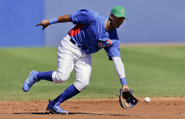
Chicago Cubs: Like the Dodgers, don't you kinda identify them with blue? Doesn't this kinda make it look like the flea-market version of Mexico's WBC cap?
* * *
Cincinnati Reds: Dudes! You're called the Reds.

* * *
New York Mets: Yes, the Mets look odd in green, but at least they've got this going for them: They knew enough to bring their own leprechaun.

* * *
And now, how about one that actually looked pretty good?
Baltimore Orioles: Sure, it clashes with the uniform, but in a bizzaro world where the O's have a different color scheme, this cap would look quite slick.

Shout out to the Oakland A's who don't have to suffer through anything weird on St. Patrick's Day.
Are you ready for opening day?
Follow @MikeOz and @bigleaguestew, on Twitter, along with the BLS Facebook page.
No comments:
Post a Comment